



Why balance and axis have organised buildings across every culture, and the forms symmetry takes once a design leaves the page.
Symmetry describes harmony in dimension, proportion and arrangement. In a building it is carried by the distribution of components and by the intervals between them, usually organised around an axis, with patterns answering each other on either side. Which kind of symmetry appears, and how insistently, depends on period and culture as much as on the individual architect.
The idea runs all the way down. It governs where a building sits on its site, and it reappears in the roof pattern, the border detail and the tile mosaic.
Three ways of understanding symmetry
Architecture did not invent symmetry. It inherited the idea from three fields that had already worked it out, and understanding where each one takes it makes the architectural applications considerably easier to read.
Mathematics
Symmetry belongs to mathematics before it belongs to design. It appears in any geometric transformation, and more fundamentally as a form of invariance, the property by which an object remains unchanged under a given operation. The same idea runs through spatial relationships, the mapping of objects onto one another, and calculus.
This is the strictest definition available, and it is the one that lets an architect say precisely which kind of symmetry a building holds rather than simply calling it balanced.
Nature
Nature supplies the more persuasive argument, and the more familiar one. A pinecone, the leaf arrangement of a succulent, the wings of a butterfly and the intricate structure of a snowflake all resolve into balance without anyone having designed them to.
That matters for architecture because it explains why symmetry feels correct rather than merely being correct. People read balance quickly and instinctively, having spent their lives surrounded by it, which is what gives a symmetrical building its immediate legibility.
Art and music
Art, taking its cues from the world around it, absorbed the same logic. In Leonardo's Last Supper the figures differ on either side of the table, yet the composition holds. The groupings are balanced in number, the colour is distributed evenly across the picture, and the architecture behind the figures answers itself across the centre line.
Music does something comparable through symmetric scales, which divide the octave into equal intervals to produce a balanced harmony. The idea was formalised in the early twentieth century by Joseph Schillinger, whose system treats music as a form of movement and therefore as something that can be made symmetrical in the same sense a building can.
Symmetry across cultures and eras
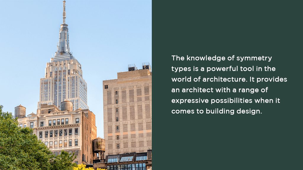
Architecture inherits all three readings at once. Symmetry organises the Pantheon in Rome and the Empire State Building alike, running from the placement of a building on its site down through the floor plan to the tile mosaic.
It structures the ornament of Islamic buildings such as the Taj Mahal and the Sheikh Lotfollah Mosque. Moorish work like the Alhambra goes further still, layering translation, reflection and rotation into patterns of considerable complexity.
Solid and void
Identifying symmetry in a two-dimensional composition is straightforward. Doing so in three dimensions is harder, because perception shifts as the viewer moves around the object. This is where architecture becomes more interesting than drawing, and it works through two components.
The solid is what most people recognise. Buildings are categorised by their solid elements, a Greek temple by its portico and pediment, a Gothic cathedral by pointed arches and flying buttresses.
Those solids form an envelope around the void, which is the space actually inhabited. Shaping that void is the architect's real work, since it becomes the setting for everything that happens inside. Symmetry there is experienced rather than observed, which makes it the harder half of the problem.
Bilateral symmetry, the most common form
Bilateral symmetry appears in every culture and every era. The composition is a mirror image across a single axis, as in the facade of the Pantheon in Rome.
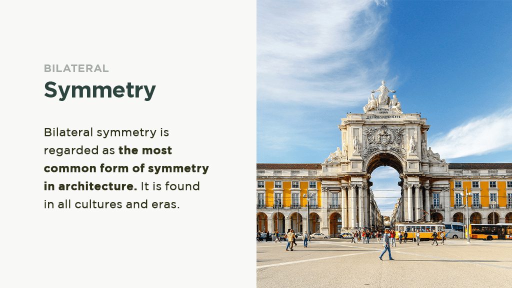
It scales up to the city. The Praça do Comércio in Lisbon organises three urban elements along one long horizontal axis, a principal public square, a monumental gate and a wide commercial street running beyond it, with the axis governing how the whole sequence is read. The form's popularity probably owes something to the body: humans are bilaterally symmetrical, and architecture has long been built in the image of the people who use it.
Not all bilateral symmetry is equally welcome. Dualism, where a composition splits into two equal halves with nothing at the centre, has traditionally been avoided.
Ancient Greek examples
Greek temples were conventionally built with an even number of columns across the facade, precisely so that no column would land on the central axis and block the view through. The aversion has older roots. In Pythagorean number symbolism, even numbers were female and divisible, and therefore treated as unstable, while odd numbers such as three were male and could not be halved.
Orsanmichele in Florence
Modern architectural theory has been no kinder to dualism, describing it as an elementary blunder tied to ambiguity. The fourteenth century Orsanmichele in Florence shows why the objection has force. The building holds an oratory on the ground floor with an unusual two-aisled plan and two altars, which leaves a visitor having to choose which one to stand before. Architects normally resolve that for the audience by placing a single altar on the centre line. Where they do not, the ambiguity is felt.
Rotation and reflection
Rotation and reflection generate movement and rhythm, and they concentrate attention on a central point.
The octagonal sacristy of the Basilica di Santo Spirito in Florence is built on exactly this logic, with the architecture and the pavement pattern both organised rotationally. Domes work the same way, from the hemispherical rotunda of the Pantheon to the octagonal cupola of Florence Cathedral.
Radial symmetry is the same principle taken to its conclusion, working from a circle rather than a rectangle, divided like a cake into equal segments. The rose windows of churches and cathedrals are the clearest expression of it.
Cylindrical, spherical and chiral forms
Cylindrical symmetry, in towers and columns, reads as resistance to gravity. Spherical symmetry is rare, largely because people move across a horizontal plane and a sphere resists that, though Étienne-Louis Boullée's 1784 cenotaph for Isaac Newton remains the great demonstration of what it might offer.
Chiral symmetry is less discussed and more useful than it appears. Two forms mirror each other without being superimposable, as in the opposing colonnades framing the elliptical piazza before St Peter's. A subtler version appears in the two leaning towers of the Puerta de Europa in Madrid, designed by Philip Johnson and John Burgee, where the inclination pulls the eye towards the boulevard passing between them and builds the gateway the name promises.
Similarity symmetry
Similarity symmetry, related to fractals, occurs when repeated elements change scale without changing shape.
The nested shells of the Sydney Opera House are the familiar example. Jørn Utzon won the competition in 1957, construction began in 1959, and the building completed in 1973. The shells differ in size and inclination while holding a constant geometry, all of them derived from the surface of a single sphere.
The principle also works where nothing about it is visible. Frank Lloyd Wright used an equilateral triangle as the planning module for the Palmer House in Ann Arbor, Michigan, in the early 1950s, repeating it at several scales to organise the whole house. Similarity symmetry can impose considerable order on a design without ever announcing itself.
Spiral symmetry
Spiral and helical symmetry is a particular case of similarity symmetry, and it tends to communicate continuity. A spiral staircase makes the flow between levels legible in a way that a stair core never does.
Wright took the idea to its limit at the Solomon R. Guggenheim Museum in New York, commissioned in 1943 and completed in 1959. The exterior expresses the giant helical ramp inside, with galleries arranged along one edge of it. Visitors ride to the top and descend on foot, and the building turns spatial continuity into the experience of looking at art.
Translational symmetry
Translational symmetry is the second most common form after bilateral. Elements repeat in one direction along a row of columns or through the successive arches of an aqueduct, and in two directions across the wallpaper-like patterning of a modern curtain wall.
It also covers the repetition of whole building sections, which is where the criticism lands: repeated at scale and without variation, translation reads as monotony. Used deliberately, it is what gives a colonnade its rhythm.
The knowledge of symmetry types is a powerful tool in the world of architecture. It provides an architect with a range of expressive possibilities when it comes to building design. However, there is another aspect of symmetry covered in architecture. This is the void that is the architectural space and is the aspect of symmetry that we do not see.
Centre and path
Architectural space can be understood through two concepts, centre and path. The centre is a single significant space within a larger whole, a church altar being the obvious case. The path is the movement of a person through that space. In symmetrical terms, the centre is a point and the path an axis, and the relationship between them shapes how a space is understood from moment to moment.
Roman axial symmetry
Roman architecture is defined by strict axial symmetry, producing spaces that are monumental and static, weighted towards equilibrium rather than movement.
The Roman basilica, a secular building used as a court of law, makes this plain. The plan is rectangular, with an apse at each end of the primary axis and doorways at each end of the minor axis. Elements always face their own kind, apse to apse, column to column, doorway to doorway. Surviving basilica pavements reinforce it, patterned with translational symmetry in two directions rather than anything rotational.
The Pantheon rotunda repeats the arrangement in the round, its circular plan carrying multiple reflection planes and rotational symmetry, with apse facing apse, aedicule facing aedicule, niche facing niche and column facing column.
How Christian architects rebalanced the basilica
Once Christianity was legalised in the fourth century, architects reworked the Roman basilica for liturgical use. Entrances were removed from the minor axis and replaced by a single door at one end of the primary axis, and an altar was placed in the remaining apse.
The change is more radical than it sounds. What had been a balanced, multi-axial plan became a directional one, holding a single reflection plane and no rotation, which is precisely what a bilaterally symmetrical Christian basilica requires. Symmetry was not abandoned, it was reduced to the one axis that the ritual needed.
From plan to paving
Human perception of symmetry is unusually acute. People detect it, and detect breaks in it, almost immediately, which is why the axis carries so much weight in how a building is read.
That sensitivity does not stop at the building line. It runs through the paving, the drainage lines and the grate patterns that complete a scheme at ground level, where a misaligned run is noticed long before anyone can say why. Talk to our team about carrying a design's geometry all the way down to the hardscape.


